Tuesday, March 24, 2009
Tuesday, March 17, 2009
design workbook
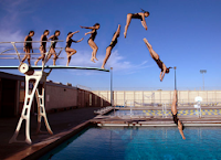
this picture shows movement because its pretty obvious that the swimmer looks like they are moving through the picture to dive into the water.
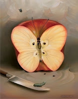 this picture shows variety, or the use of several elements of design to hold the viewer's attention. line, color, and shape are all being used in this picture.
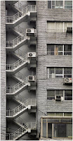 this picture shows unity, or the feeling of harmony between all parts of the artwork. this is shown with the fire escape latter drawing your eye all the way up and down the picture.
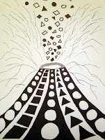
this picture works for pattern because of the way the shapes on the volcano go from circle to square and back to circle.
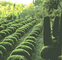
i think that this picture works for rhythm because every website i looked on said that rhythm is also known as repetition. this picture demonstrates rhythm with all the little shrubs.
Monday, March 16, 2009
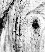
this picture works for texture because the surface quality of the image appears to be rough. looking at the picture, you can almost imagine how the tree would feel.
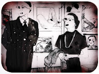
this picture works for shape because it contains lines that cross themselves and intersect with other lines to create an object.
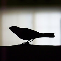
this image works for value because it shows a range of lightness and darkness.
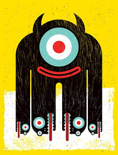
this picture works for color because it contains some of the primary colors on the color wheel.
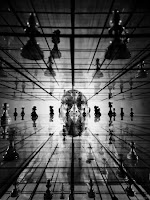 this picture works for form because it gives the viewer the effect of three dimensionality.
 this image works for line because it contains all of the characteristics of the line element. Those characteristics include width, length, direction, focus, and feeling.
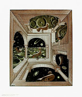
this image works for space because it appears to be three dimensional. you almost feel like you could walk into the painting.
Subscribe to:
Posts (Atom)


